Responsive tables in CMSB
13 posts by 3 authors in: Forums > CMS Builder
Last Post: July 22, 2023 (RSS)
By andreasml - July 16, 2023 - edited: July 17, 2023
Hi
I wonder whether it is possible to transform the sections' tables of CMSB in responsive tables (such as those found in https://elvery.net/demo/responsive-tables/) so that they will be seen better on a mobile phone screen?
Should I make changes in css color/theme files (/logbook/3rdParty/clipone/css/)?
Regards,
Andreas Lazaris
By Dave - July 17, 2023
Hi Andreas,
It would certainly be possible to do that with some custom javascript and CSS. The issue would be how to specify which fields to omit unless you were going to hard code that. If you add "hidden-xs" to the columns you want hidden they should disappear when the page width is less than 768px.
interactivetools.com
By andreasml - July 17, 2023 - edited: July 17, 2023
Hi Dave
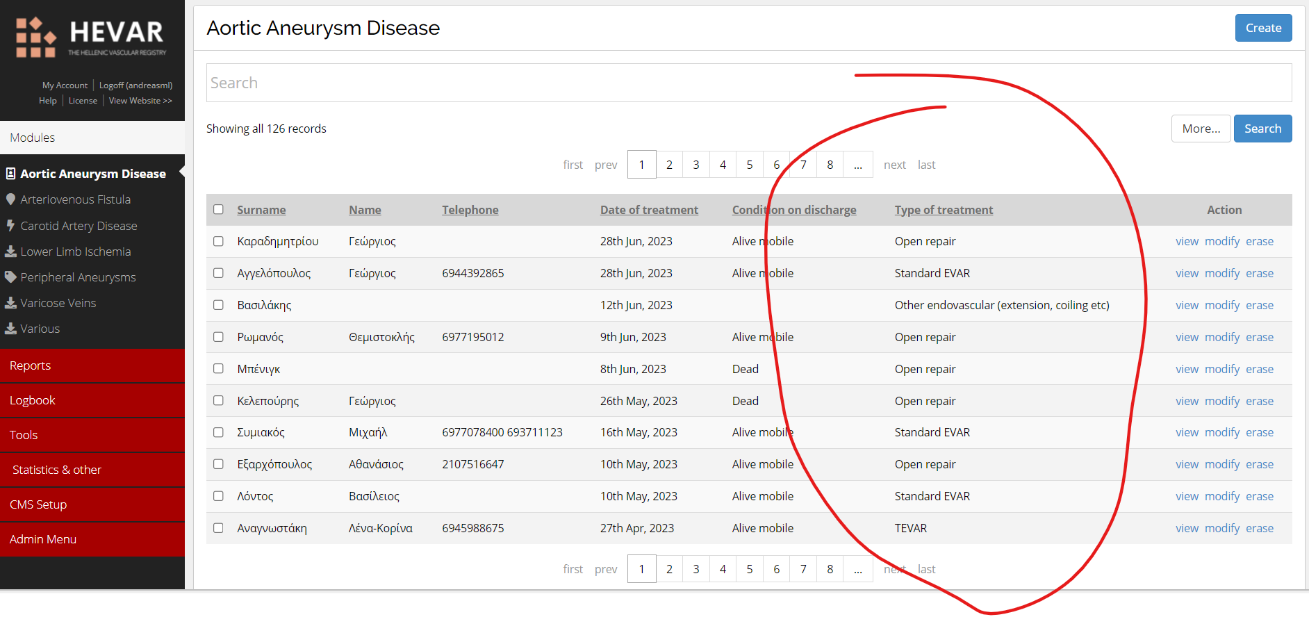
Thanks for the reply. Again, I have not understood how I can do this for the table as seen on the first screen of every CMSB section.
I have left an example with a screenshot to understand what I am talking about. Suppose you want to omit the field in the red circle. How can it be done? Is there a specific file where I need to make these changes?
Regards,
Andreas
By Djulia - July 17, 2023 - edited: July 18, 2023
Hi Andreas,
Can you try adding the following lines to your custom.css file?
@media only screen and (max-width: 800px) {
[data-table="your_table"] tbody td:nth-child(7),
[data-table="your_table"] thead th:nth-child(7) { display: none; }
}
@media only screen and (max-width: 640px) {
[data-table="your_table"] tbody td:nth-child(5),
[data-table="your_table"] thead th:nth-child(5),
[data-table="your_table"] tbody td:nth-child(6),
[data-table="your_table"] thead th:nth-child(6) { display: none; }
}
your_table = table name, (7) = column number
Thanks,
Djulia
By andreasml - July 18, 2023
Hi Djulia,
Thank you for your answer. I added your code to the Color / Theme CSS file, but unfortunately, I do not see any difference (I assume it is because of my fault and not your code).
Here are a few questions to help me get some idea of what your code does:
- What is the objective of the code?
- At your table, I assume I have to put the name of the section's name. Should I use only the name or together with its prefix? And what if I want to use it in more than one section? Should I copy the same code with a different table's name for each section?
What I would like to achieve is to make the section tables more user-friendly in a mobile screen environment, without the need to pinch out or scrolling horizontally to see all the details, etc.
Thanks anyway for your time,
Best regards,
Andreas
By Djulia - July 18, 2023 - edited: July 18, 2023
Hi Andreas,
You need to add the code in your custom.css file in the CMSB installation folder (not in the Color/Theme CSS file).
You can find information in the custom.css.readme file.
>> What is the objective of the code?
The code will hide the columns on smaller screen sizes. The first example in your link (The Unseen Column).
The approach uses "Media queries" and "Attribute Selectors" to target the table :
https://developer.mozilla.org/en-US/docs/Web/CSS/CSS_media_queries/Using_media_queries
https://developer.mozilla.org/en-US/docs/Web/CSS/Attribute_selectors
>> At your table, I assume I have to put the name of the section's name.
Yes, the section name only without the prefix. And, yes, you have to add the code for each section you want to be adapted.
I hope this can help you.
Thanks,
Djulia
By andreasml - July 19, 2023 - edited: July 19, 2023
Hi Djulia
Great!! It does work!!! Thank you so much!!!
Some more questions:
- Can you also provide me the code for the third example on my link ("No More Tables")?
- How can I change the action links (view, modify, erase) from texts to buttons?
- Is it possible to apply the some responsive type of tables in the reports as well?
Kind regards,
Andreas
By Djulia - July 19, 2023 - edited: July 20, 2023
Hi Andreas,
>>Can you also provide me the code for the third example on my link ("No More Tables")?
You can use the following CSS code :
@media only screen and (max-width: 800px) {

	/* Force table to not be like tables anymore */
	[data-table="your_table"] table,
	[data-table="your_table"] thead,
	[data-table="your_table"] tbody,
	[data-table="your_table"] th,
	[data-table="your_table"] td,
	[data-table="your_table"] tr {
		display: block;
	}

	/* Hide table headers (but not display: none;, for accessibility) */
	[data-table="your_table"] thead tr {
		position: absolute;
		top: -9999px;
		left: -9999px;
	}

	[data-table="your_table"] tr { border: 1px solid #ccc; }

	[data-table="your_table"] tbody td {
		border: none;
		border-bottom: 1px solid #eee;
		position: relative;
		padding-left: 50%;
		white-space: normal;
		text-align:left;
	}

	[data-table="your_table"] tbody td:before {
		display: inline-block;
		width: 45%;
		padding-right: 10px;
		white-space: nowrap;
		text-align:left;
		font-weight: bold;
	}

	/*
	Label the data
	*/
	[data-table="your_table"] tbody td:before { content: attr(data-title); }
}
It will also be necessary to use a plugin to display the headers labels (custom_td_attributes.php).
But, some labels are not accessible (actions and checkbox).
>>How can I change the action links (view, modify, erase) from texts to buttons?
You can use css code :
.listActions a:link, a:visited {
  background-color: #f44336;
  color: white;
  padding: 14px 25px;
  text-align: center;
  text-decoration: none;
  display: inline-block;
}

.listActions a:hover, a:active {
  background-color: red;
}
>> At your table, I assume I have to put the name of the section's name.
If you want to use this approach for all sections, you can replace [data-table="your_table"] with [data-table]. But, you also need to modify the plugin accordingly...
@media only screen and (max-width: 800px) {

	[data-table].table {
		table-layout: fixed;
		width: 100%;
		margin: auto;
	}

	/* Force table to not be like tables anymore */
	[data-table] th,
	[data-table] td,
	[data-table] tr {
		display: block;
		width: auto;
	}

	/* Hide table headers (but not display: none;, for accessibility) */
	[data-table] thead tr {
		position: absolute;
		top: -9999px;
		left: -9999px;
	}

	[data-table] tr { border: none; }

	[data-table] tbody td {
		border: none;
		padding-left: 75%;
		white-space: nowrap;
		text-align:left;
		text-overflow: ellipsis;
		overflow: hidden;
	}

	[data-table] tbody td:before {
		display: inline-block;
		width: 25%;
		padding-right: 120px;
		white-space: nowrap;
		text-align: left;
		font-weight: bold;
	}

	/*
	Label the data
	*/
	[data-table] tbody td:before { content: attr(data-title); }

	/*
	Actions
	*/
	[data-table] .listActions { white-space: normal; }
	[data-table] .listActions a:link, a:visited {
	  background-color: #FF7600;
	  color: white;
	  padding: 7px 12px;
	  text-align: center;
	  text-decoration: none;
	  display: inline-block;
	}

	[data-table] .listActions a:hover, a:active {
	  background-color: red;
	}
}
I hope this can help you.
Thanks,
Djulia
By andreasml - July 20, 2023 - edited: July 20, 2023
Thank you, Djulia. It is a great help.
By the way, can you check the code for the plugin, as it does not seem to respond?
<?php
/*
Plugin Name: Custom td attributes
Description: Custom td attributes...
Version: 1.00
Requires at least: 2.65
*/

//
addFilter('listRow_tdAttributes', '_customtdAttributes', null, 4);

//
function _customtdAttributes($tdAttributes, $tableName, $fieldname, $record) {

	//
	if (@$tableName == '[data-table]') {
		$fieldLabel = _getFieldLabel($fieldname);
		$tdAttributes = 'data-title="'.$fieldLabel.'"';
	}

	//
	return $tdAttributes; // for all other fields
}
Also, do you know if it Is possible to apply the same responsive type of tables in the reports as well?
Many thanks again,
Andreas
By Djulia - July 20, 2023 - edited: July 20, 2023
Hi Andreas,
Can you replace "[data-table]" with your table name (without the prefix)?
>>Also, do you know if it Is possible to apply the same responsive type of tables in the reports as well?
Yes, you will find the table line 196 in the plugin.
Thanks,
Djulia