make record list width always fit the browser window
9 posts by 4 authors in: Forums > CMS Builder
Last Post: December 23, 2017 (RSS)
By gkornbluth - December 17, 2017 - edited: December 17, 2017
Hi All,
It's a rather small issue, which I brought up back in Feb 2015 when you were working on the first responsive UI, but part of the solution seems to have slipped under the radar.
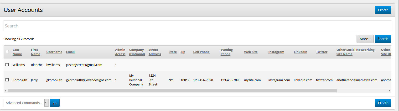
Is there a way to set the width of a record list (including the displayed data) so that it always fits the width of the browser window?
It seems that the list page field labels themselves always fit, but when there is data displayed for those fields, the data can easily push the page width past where a scroll bar is required.
I'm using Firefox (PC), and have always found (up to 3.10) that if I have a number of ListPage fields that display data as columns in a record list, I have to scroll to the modify/erase for each record. Same in IE, Safari and Chrome.
Example images are attached.
Thanks,
Jerry Kornbluth
Take advantage of a free 3 month trial subscription, only for CMSB users, at: http://www.thecmsbcookbook.com/trial.php
By Dave - December 19, 2017
Hi Jerry,
That's an interesting issue. What would you like it to do instead? Have the content wrap inside the column cell and make it taller?
interactivetools.com
By Toledoh - December 19, 2017
I think the scrolling table is the only way to go, as everyone has different requirements here and the standard bootstrap answer is to do this.
We could start wrapping content, or adding additional variables to each column - but it would get messy very quickly.
Maybe at certain breakpoints we could have the action column display as the first column? Simply have the first column with .visible-xs so it's easier to action?
Tim (toledoh.com.au)
Not sure what the best solution would be Dave, but it does seem as if the type gets smaller to accommodate the labels, just not the data.. I'd be happy with the type getting smaller for the data as well, so that it always fits the screen it's displayed on. Especially since you can always make the type bigger with <Ctrl>/<cmd> +.
I've had a number of not so savvy sub administrators complaining that the 'modify' command didn't exist for them even though it was only a scroll away.
I (obviously wrongly) thought that the viewport command took care of fitting existing content to a screen.
Maybe some more visible indicator that there was more data to the right, maybe putting the operators, like modify and save, etc, on the left side of the screen.
Just a few thoughts,
Jerry Kornbluth
Take advantage of a free 3 month trial subscription, only for CMSB users, at: http://www.thecmsbcookbook.com/trial.php
By Dave - December 22, 2017
Hi Guys,
Check out these 3 options: https://elvery.net/demo/responsive-tables/
I'm liking the "No More Tables" approach for small screens. Or many something that hides extra columns when the table is too narrow and then has a "+" or "more >>" link that shows the extra fields on mouseover.
Thoughts?
interactivetools.com
By Djulia - December 23, 2017 - edited: December 23, 2017
Hi Dave,
I also like this approach (toggleView):
http://issues.wenzhixin.net.cn/bootstrap-table/#methods/toggleView.html
Basic Columns/Large Columns
http://issues.wenzhixin.net.cn/bootstrap-table/#options/basic-columns.html
...and Detail View (...):
http://issues.wenzhixin.net.cn/bootstrap-table/#options/detail-view.html
Documentation :
http://bootstrap-table.wenzhixin.net.cn/documentation/
Thanks,
Djulia
Hi All,
When I originally posted, I wasn’t even thinking of small screens. I was dealing with clients using large desktop screens who thought that the ‘modify’ button was missing. (I know, but it has happened too often to be ignored.)
Both ‘No More Tables’ and ‘Toggle View’ are interesting approaches, but I kind of tend towards the automatic approach. And in my specific case, I’d still like to see the operational links (like modify, etc.) on the left rather than on the right so that they never disappeared off the screen. Then maybe the 'SCROLL FOR MORE' notice would be unnecessary.
I guess I’m old school, but I can’t see doing much more than casual back end site management on a smart phone or even tablet sized screen. And for front end users, using responsive report/form pages for information viewing and user input on their various sized devices.
This is somewhat related, although off the topic, but I’ve always felt, as have others along the way, that both the strictly linear, vertical field approach to record design and the strictly horizontal list page fields approach, either take up much too much screen real estate, leave too much white space, or result in too much vertical scrolling to get to specific fields on complex records.
I’m sure that it would take a huge amount of programing, and might upset the balance between overly simple and overly complex, but it would be interesting to be able to optionally:
1) display some fields next to each other in a record view (think a series of check boxes or pull downs that were related, or last name middle initial first name, etc.), and,
2) have some field groups (think address blocks or check boxes ) nested above each other in record list, list page fields (like the toggle view when toggled), while other fields were shown next to each other.
Would it be possible to incorporate the use of anchor tags to navigate around a record with a large number of fields. Or to have collapsible field groups the way menu groups work.
While I’m on a roll, when designing records, easily variable initial text sizes, fonts and colors for individual fields would be nice too, as well as some drag and drop capability.
Nuff for one post...
Best,
Jerry Kornbluth
Take advantage of a free 3 month trial subscription, only for CMSB users, at: http://www.thecmsbcookbook.com/trial.php
By Djulia - December 23, 2017 - edited: December 24, 2017
Hi Jery,
If you are interested, you can use the extention mobile:
http://issues.wenzhixin.net.cn/bootstrap-table/#extensions/mobile.html
Or for another approach :
http://gergeo.se/RWD-Table-Patterns/#demo
https://github.com/filamentgroup/tablesaw/
Djulia
By gkornbluth - December 23, 2017 - edited: December 23, 2017
Interesting.
Thanks Djulia.
Best for the season.
Jerry Kornbluth
Take advantage of a free 3 month trial subscription, only for CMSB users, at: http://www.thecmsbcookbook.com/trial.php